How To Freehand
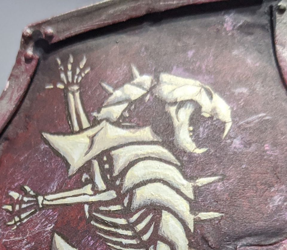
In this guide I'll show you how I've been doing my freehand work on my Warbringer Titan. I'm not good enough to paint freehand just totally from memory, and I suspect many people aren't. I get a good end product anyway with the following methods.
The first and most useful tip is to break it down mentally. You want to be taking it in phases. Your first phase is getting the proportions and scale right. Your second phase is getting the shape correct. And the third phase is any highlighting you want to do. If you can do the first two, the third one is the same as painting detailed highlights on any other piece of a model except your 'model' doesn't have edges.
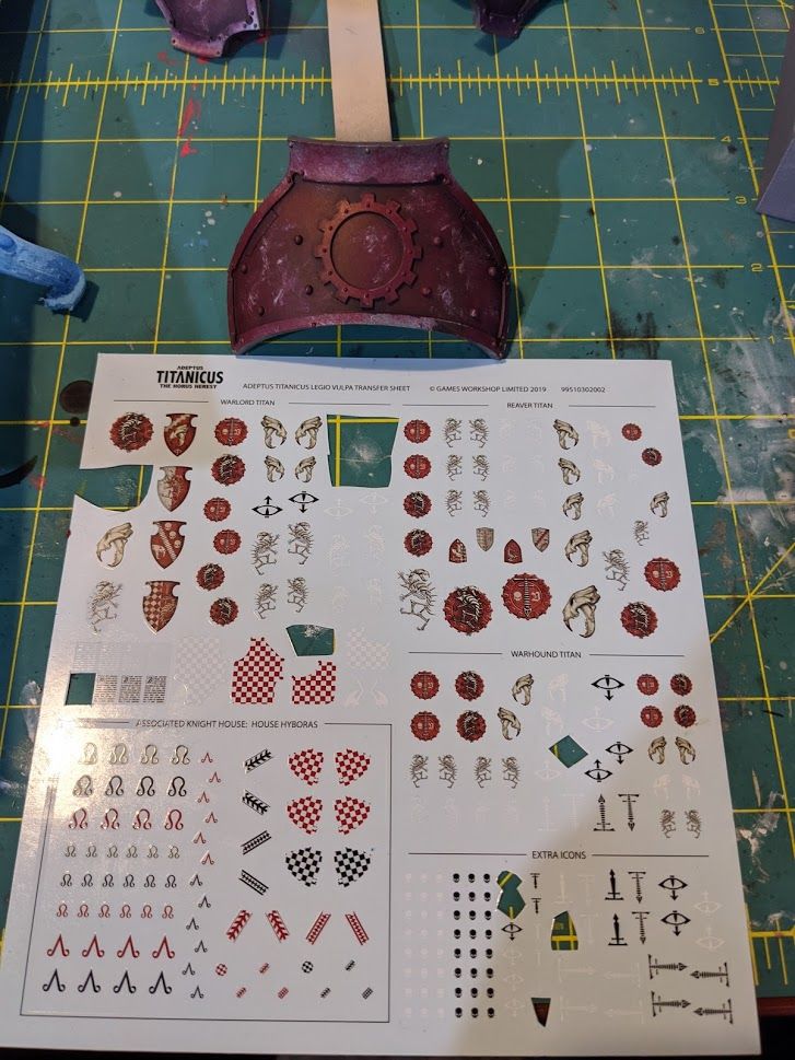
The first thing I did was try to get a reference for what I wanted. I'm specifically targeting a scheme that exists but without 28mm decals, so I know exactly what I need to paint.
I noted that there is some 'gear' icons that have a Titanicus T that is in the shape of a spine, but not in the scale I want. I want the T to almost fill the gear but the ones on the sheet don't cut it. So I scanned the decal sheet with my cheap scanner/printer all in one. I used this scan to make a bunch of different reference sizes to try until I figured out the right scale.
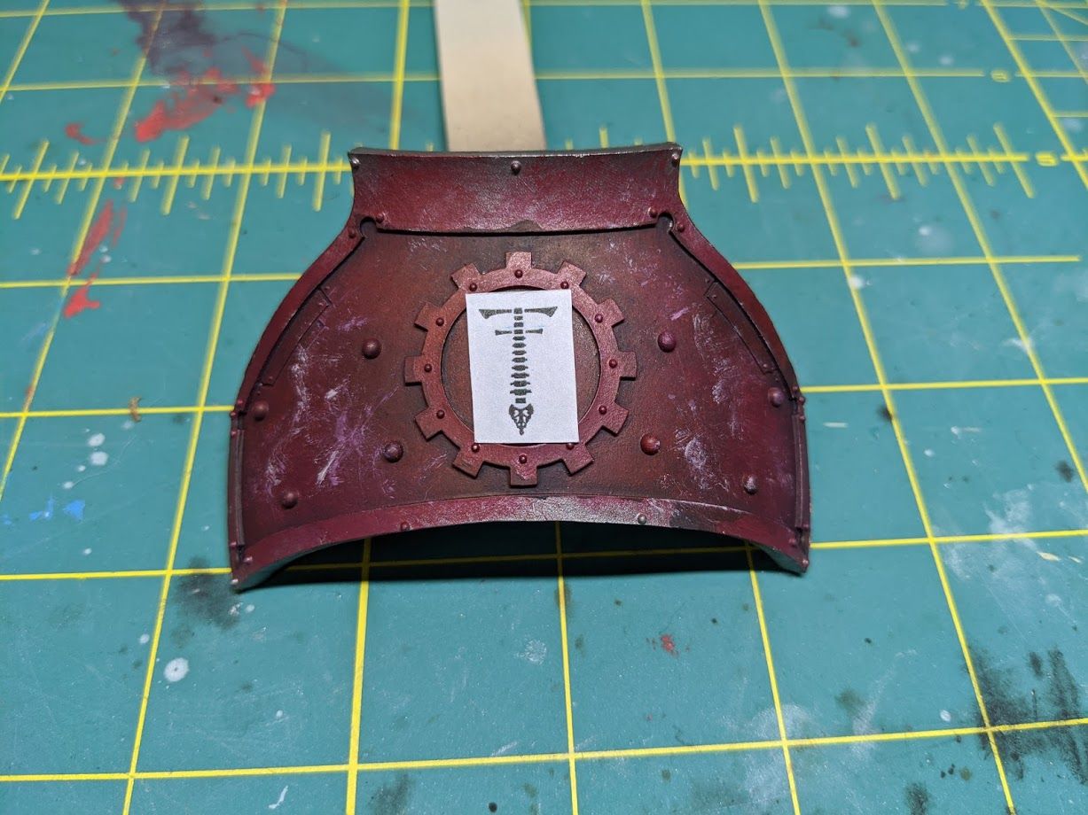
After that I printed off a couple more copies for the rest of the steps, since this one has been trimmed down pretty small. I start by making a layer of tape on my cutting mat.
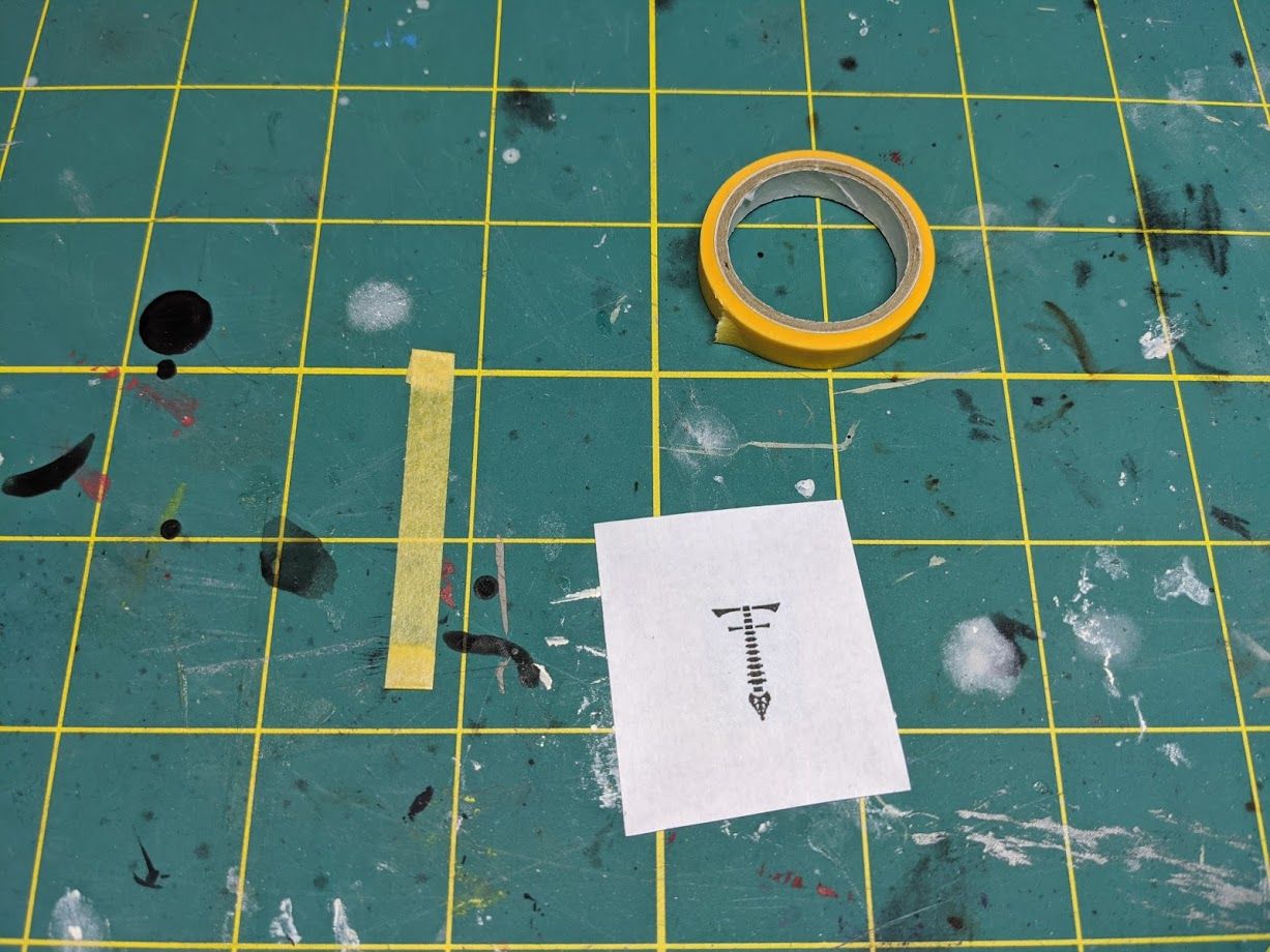
Then I take the reference image and tape it down on top to hold it in place.
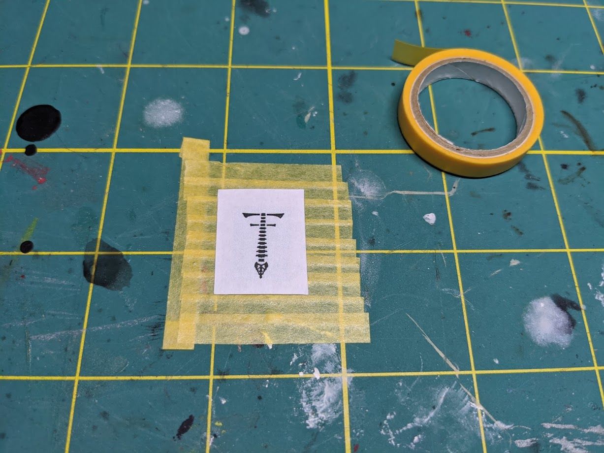
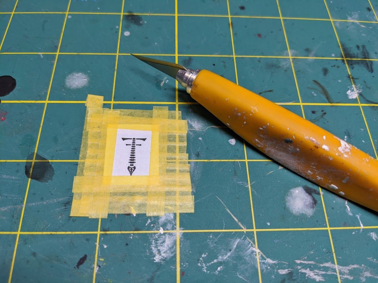
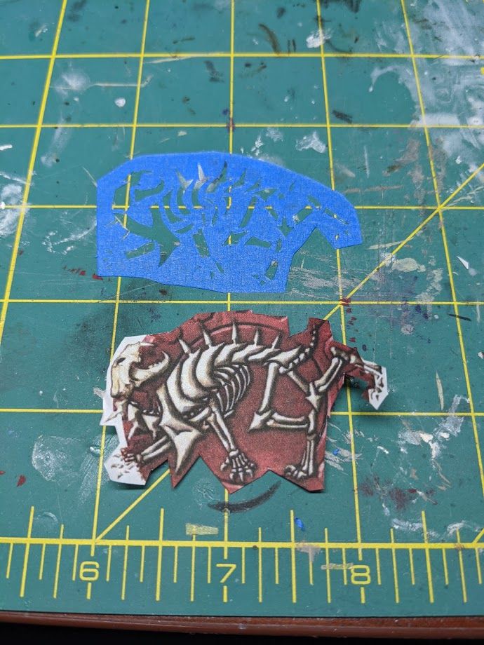
Once that's finished, I cut out the image. On this image, I note that the scale is too fine to get all the details into my stencil. That's OK, because I only need to get the rough shape and proportions right. It's a good idea to put a fresh blade on your knife for this part.
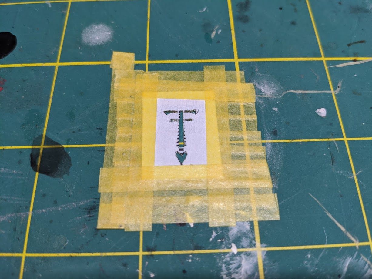
At this point I've cut just a couple blobs that represent the main image. This will get the frame on the model for me, accomplishing phase one. Peel off the reference image and tape and you're left with a stencil stuck to your mat.
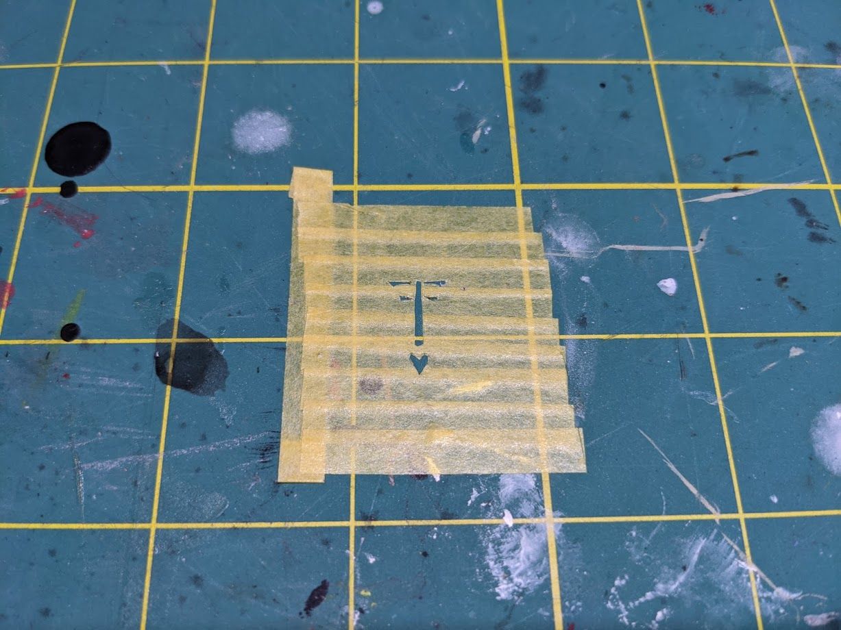
I took out some calipers and measured how much to trim off so that the tape would fit in the recessed area on the gear. You don't have to get this precise, I had them on my desk already. Just try to make sure your mask isn't running into too many parts of your model, whatever it may be.
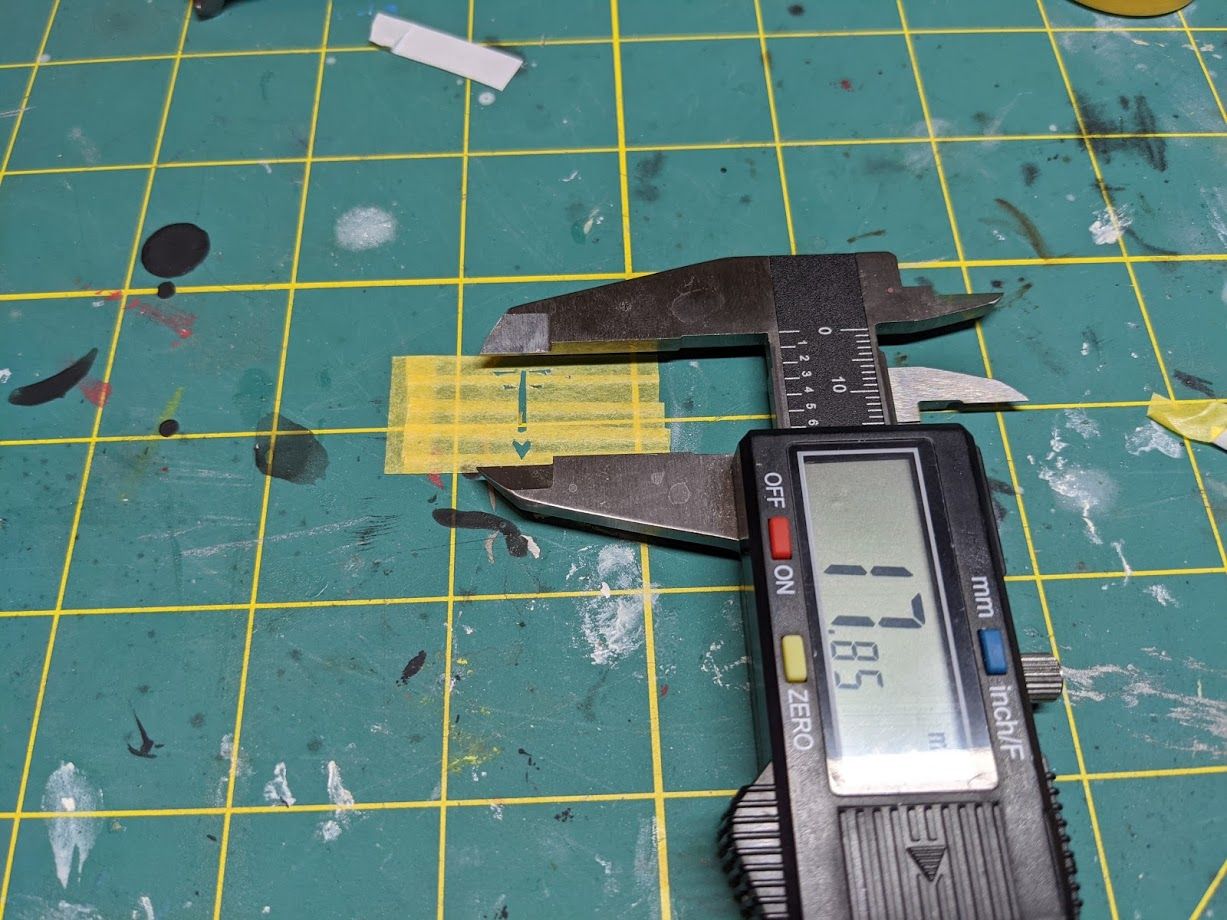
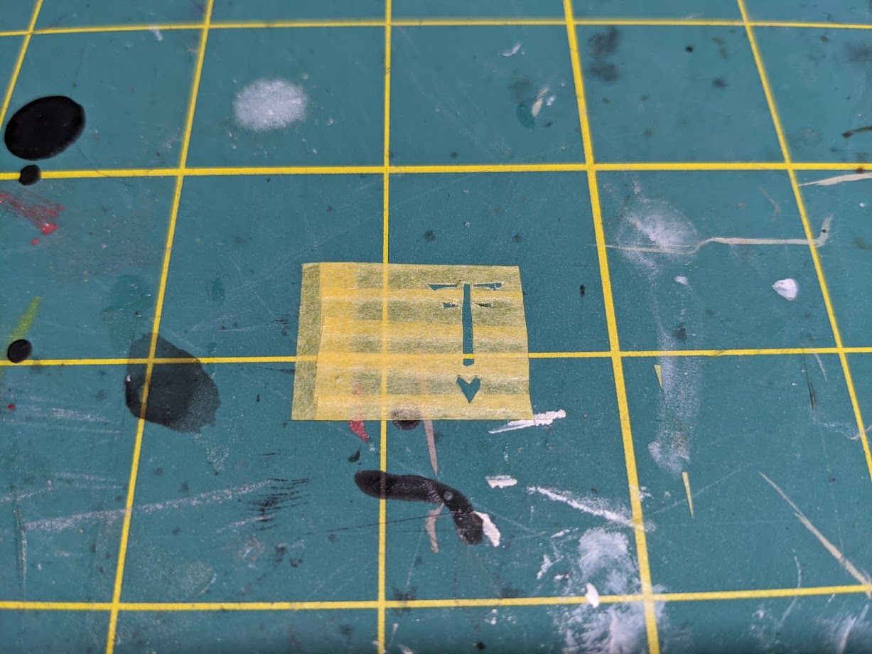
I left the left tab untrimmed and peeled it up. Once I got it into position, I trimmed the excess off leaving one small final tab in place for later. It can be helpful to have some of the tape stuck back on itself as a place to grab.
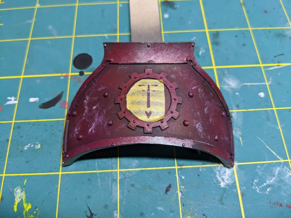
Once that's done, I just get my color blocked in. Use whatever color makes sense as if you were base coating this color on a normal piece of a model. In this case I'm making a monocolor icon, so I'm just using that color outright.
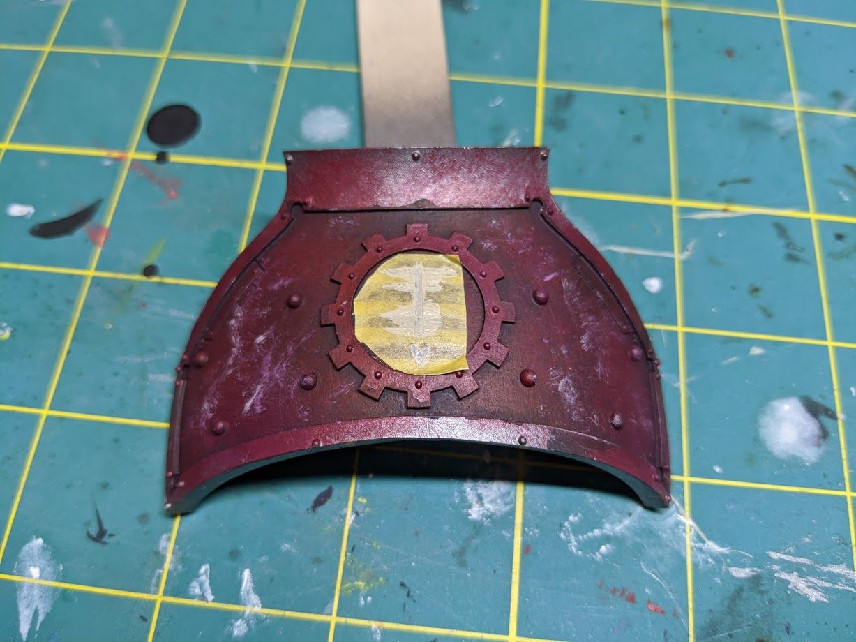
As per usual use probably two thin coats. Once it's nice and saturated over the red with this bone color I peel it back.
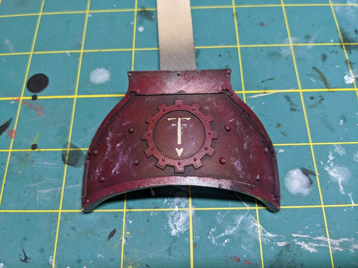
With the primary frame of reference in place I can move on to phase 2. I take one of the extras I've printed off and actually cut it right in half to get it really close to my freehand work.
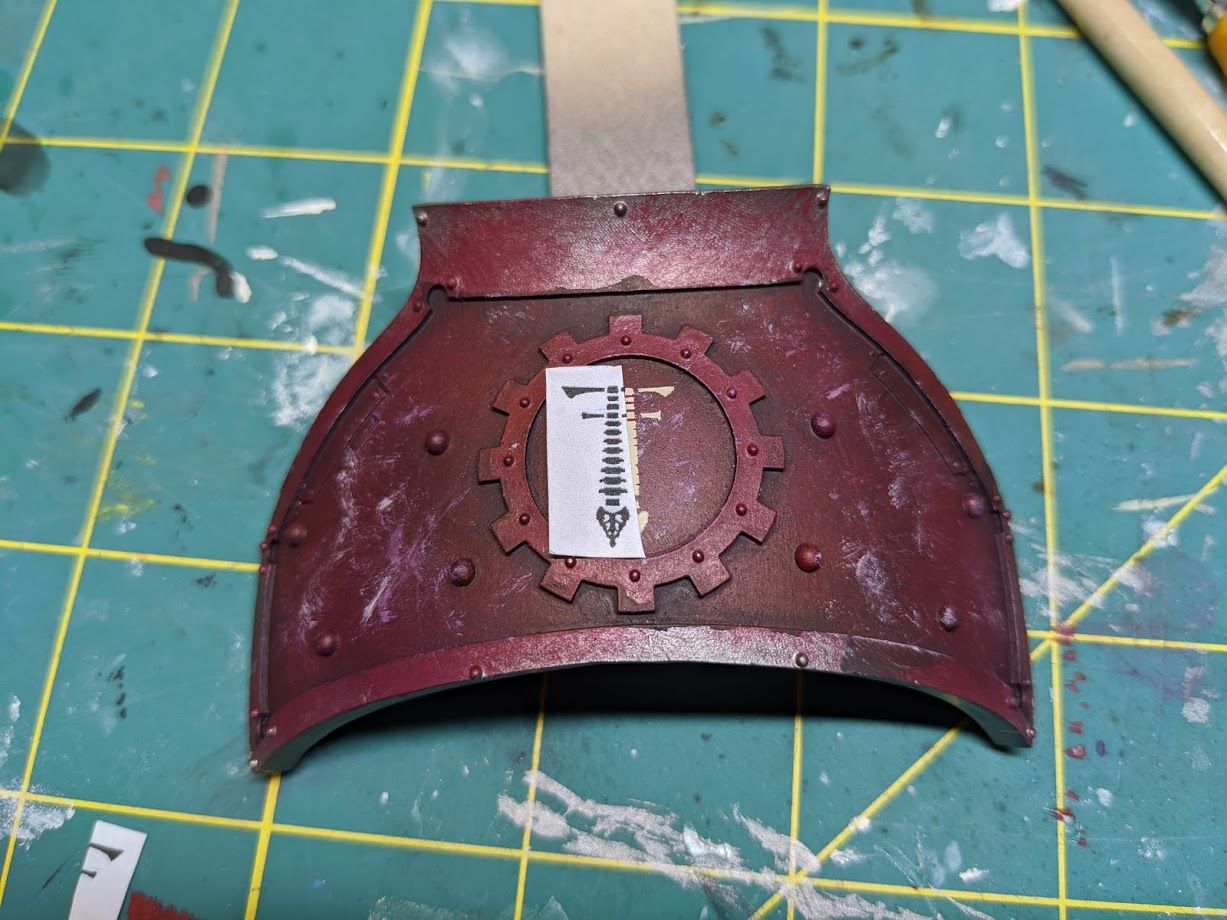
This lets me make reference tick marks next to each line of the spin in order to keep it as close as possible to evenly distributed and the reference image. After I make all my tick marks I move the reference out of the way and paint the lines the rest of the way through. I'm using a Khorne Red which is the primary base color for the background here to neaten up my image. You might be worried about losing out on shading or other subtle things with your background. Don't be. At worst you can go back and do some OK blends if you need to on big mistakes but lines to neaten up are pretty much indistinguishable from the normal pattern or shading you have on the background.
It even looks good to have some neater lining surrounding your icon. It adds a little more pop to it that is honestly missing if it blends straight into a non-solid backdrop.
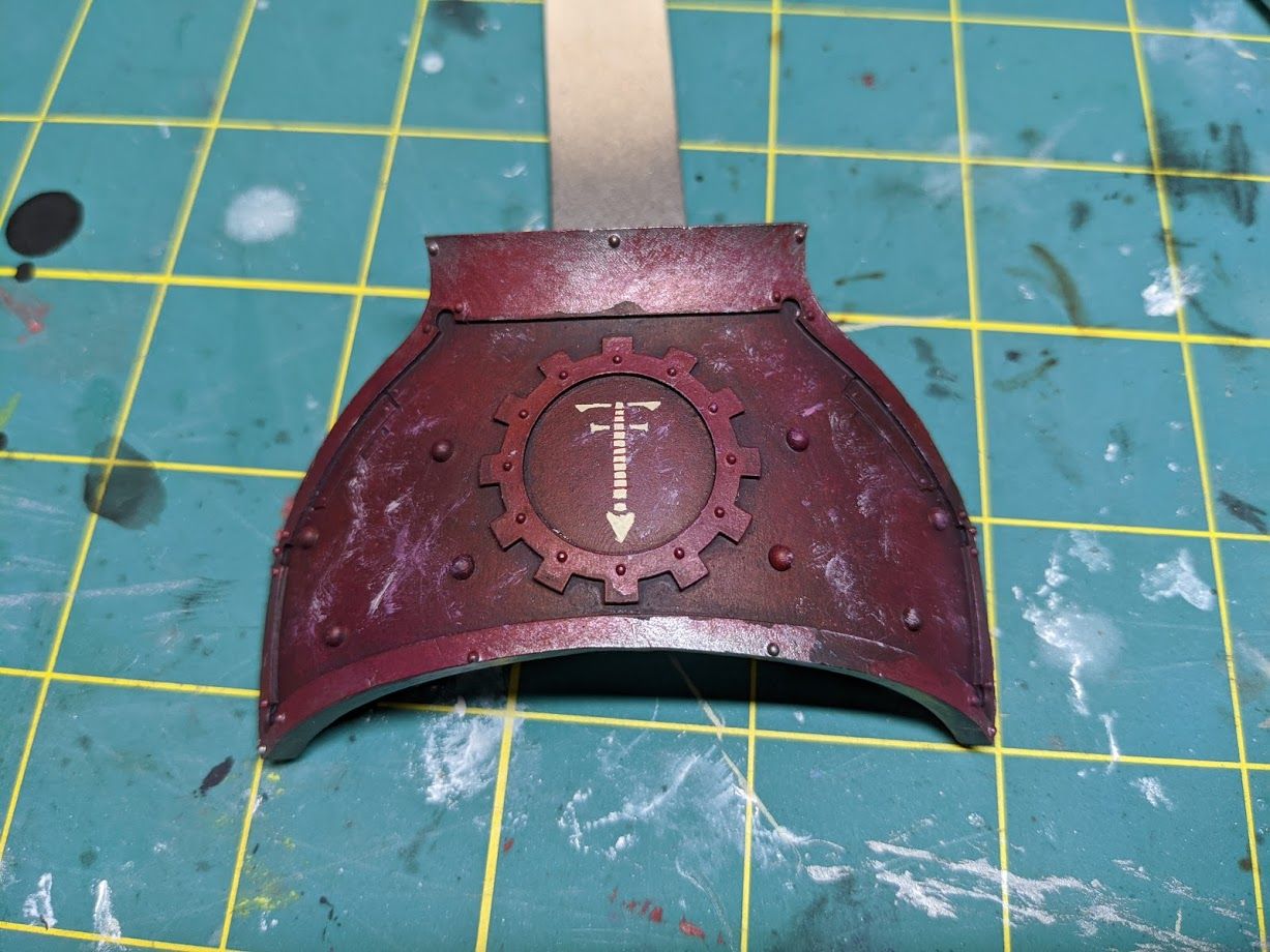
With the main lines painted through we're most of the way through phase two. Again I use the reference art nearby and keep working the icon carefully with Screaming Skull and Khorne Red to get the shape into place.
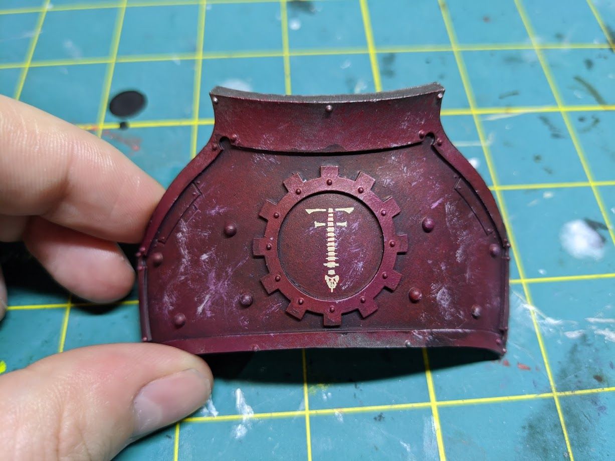
At this point I have my final shape. I'm satisfied with this and I'm not doing any shading on this example. After that I replicated the rest of the gear icon by using a skull transfer and hand painting a Legio Vulpa V. The V was totally from a reference image as a stencil would be too tiny. If you wanted a stencil for that, your best bet would be to actually just get the outline of the letter on the stencil as a solid block. Then you could have it line up nicely and use the reference to fill in the middle.
For the skull decal I didn't have a bone one in the size I wanted. I simply painted over a white one with Screaming Skull. When I missed, I cleaned it up with Khorne Red again.
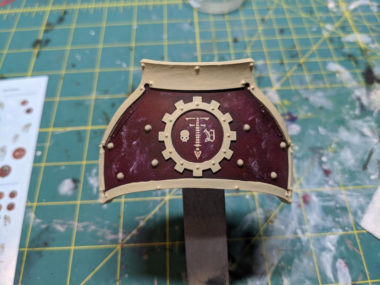
Here's the final result of my icon before I put oil work on the trim.
Next up I will go over a freehand where I've done phase three. The first few photos are references for phase one and part of phase two.
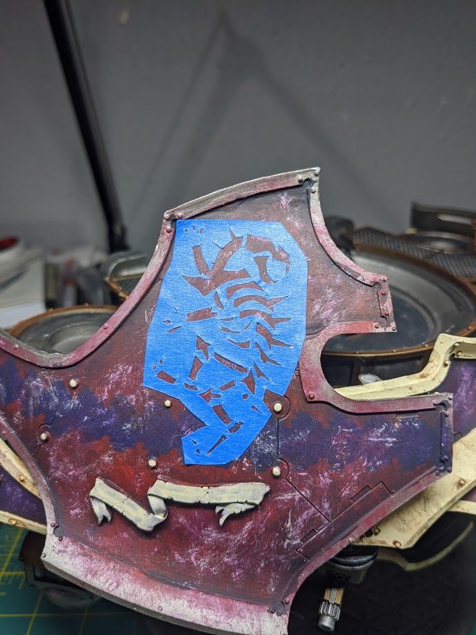
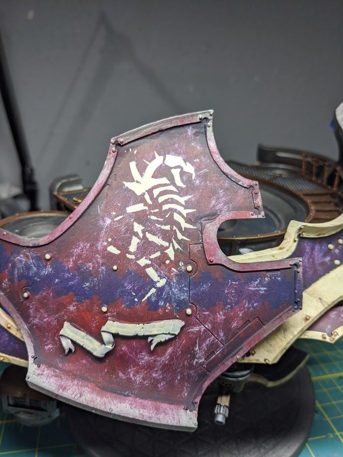
You can see a lot of bleed through but that's okay. My reference image here has a dark shade sitting around the icon and I decided before I started that would help give it a lot of depth on the model for the final product anyway. I use Rhinox Hide as a good dark brown for a shadow from the Screaming Skull to the Khorne Red.
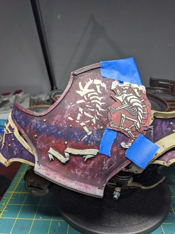
Once that was done I decided to clean up just the head with phase two and then go straight to phase three. I wanted to check my shading technique in a small area before I tried to do the entire thing and wasn't satisfied with the result.
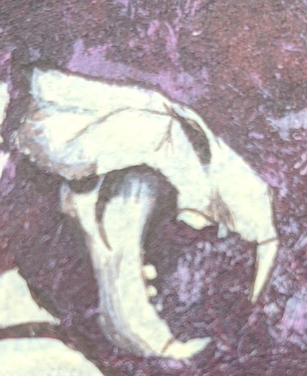
For shading I used Rhinox Hide slowly blended up to Screaming Skull on my palette and just played with layering and hatch work with my brush tip until it looked good. Once it was close I used Screaming Skull in a really wet glaze to take some of the rough transitions out. One interesting thing I learned is that a medium blend between Rhinox Hide and Screaming Skull (About 1:3, as the brown is way more saturated) looks exactly like Rakarth Flesh. Neat.
After becoming extremely satisfied with my shading and highlighting technique I moved on to working phase two on the rest of the model.
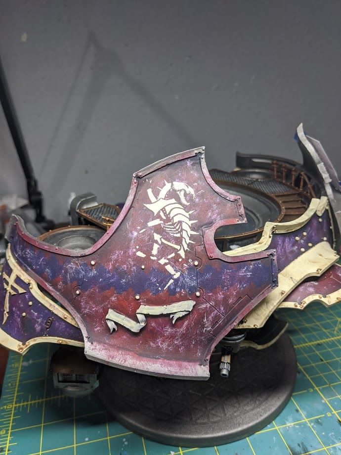
I kept working my way around with Rhinox hide to add a shadow all the way around all the edges and make the line work clean. Some parts are large blobs that have to be broken into smaller sections.
Every so often I switch back to Screaming Skull to add light colored sections that weren't covered by the stencil. I still have Rhinox Hide and Screaming Skull on my wet palette and switch back and forth on the icon depending on what I'm doing, what mistake I've just made, or what part is wet.
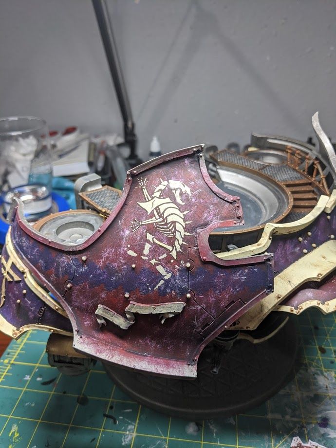
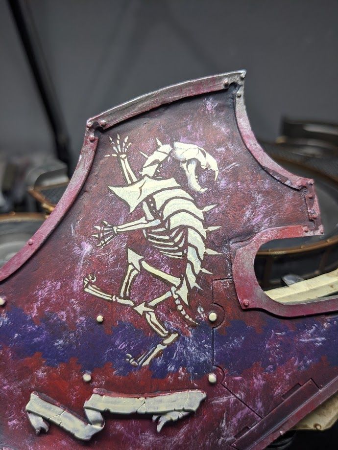
After I was done with a first pass on all the line work I went back and cleaned up anything else that didn't look right against my reference image. Not all of it is a perfect match but the spirit of the icon is the same and nothing looks horribly out of proportion.
Then I moved on to do the shading as above. I made a few different gradients on my palette and a Screaming Skull glaze.
After I did a lot of the shading that was the same as the test for the head I decided that I wanted to push the highlights more. I got out some Pallid Wych Flesh and made a soft glaze. I used this on all the brightest white parts on the reference image that gave it a final pop.
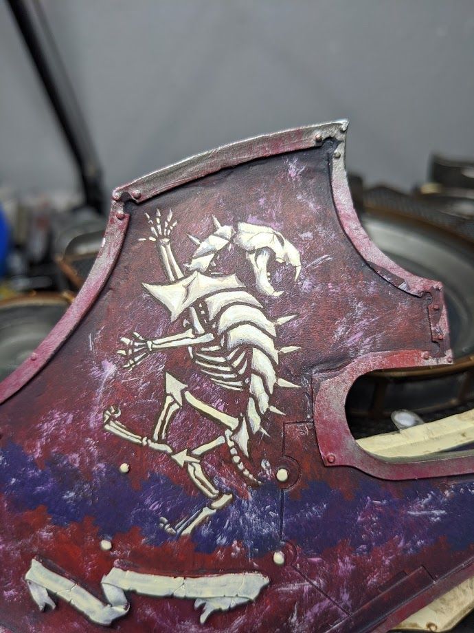
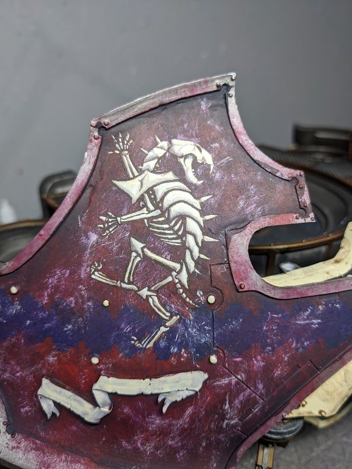
Once I stopped being burned out I was able to finish the highlighting for a final product I was satisfied with.
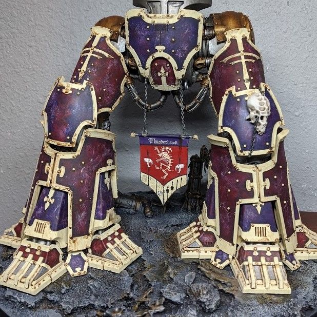
I hope this guide helps you in some small way. Whether you're planning to do a small icon or a huge diorama, I wish you luck on your freehanding adventure.
Comments ()